Back to the route Next stop: Real-Time Displays
YRT Website Redesigns
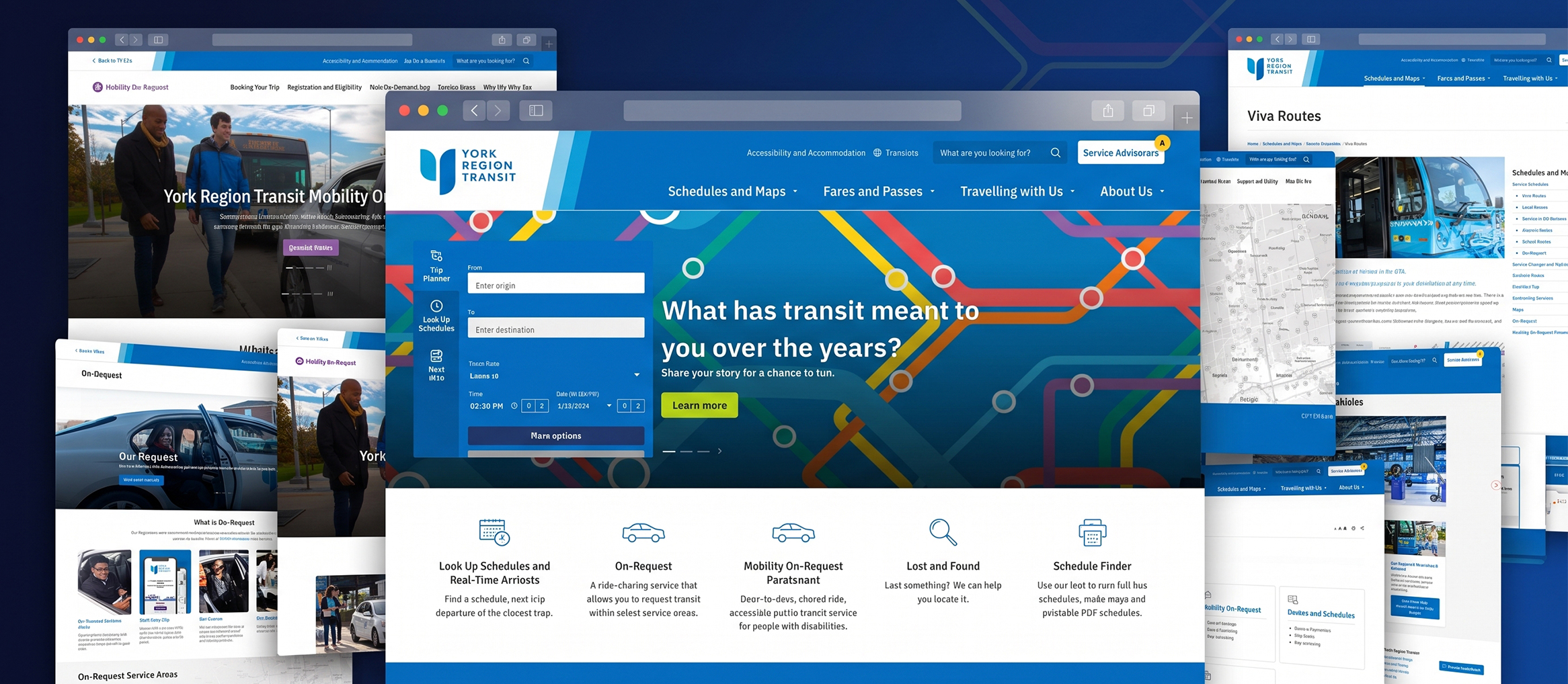
A fully accessible, mobile-first redesign of YRT.ca built around real-time trip planning and service advisories. I led two refreshes, including the 2022 one from RFP to launch.
- Role
- Organization
- York Region Transit
- Timeline
- Worked with
TL;DR
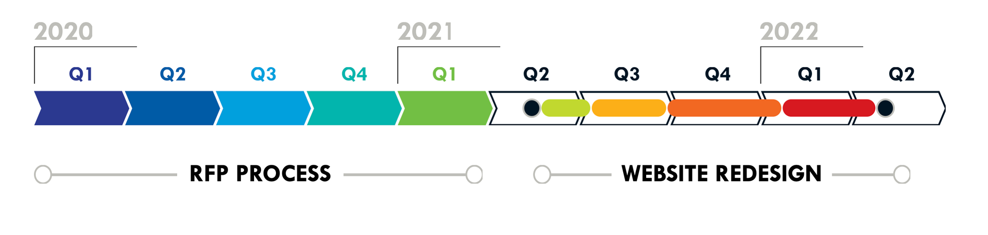
YRT refreshes its website every few years to keep up with new tools and rider needs. I led two of those refreshes, in 2019 and 2022, and this case study brings together the decisions that mattered across both. For the 2022 redesign, I acted as the client-side product owner where I wrote the scope of the public RFP, helped evaluate vendors, then partnered with the winning consultant to make sure the site worked for on-the-go riders checking their phones at bus stops, not just on a desktop.
- 3Core featuresI proposed the Service Advisories and a dedicated page for accessibility riders, and helped refine a unified Trip Planner widget
- 8Internal and external teams involvedWorked with 1 external consultant and 7 internal transit teams: Customer Service, Transit Enforcement, Operations, Scheduling, Service Planning, IT/Technology and MOR (Accessibility)
- 200+Transit staff in attendance for virtual walkthroughPresented the new site and its features to transit staff in a remote walkthrough before launch
The Problem
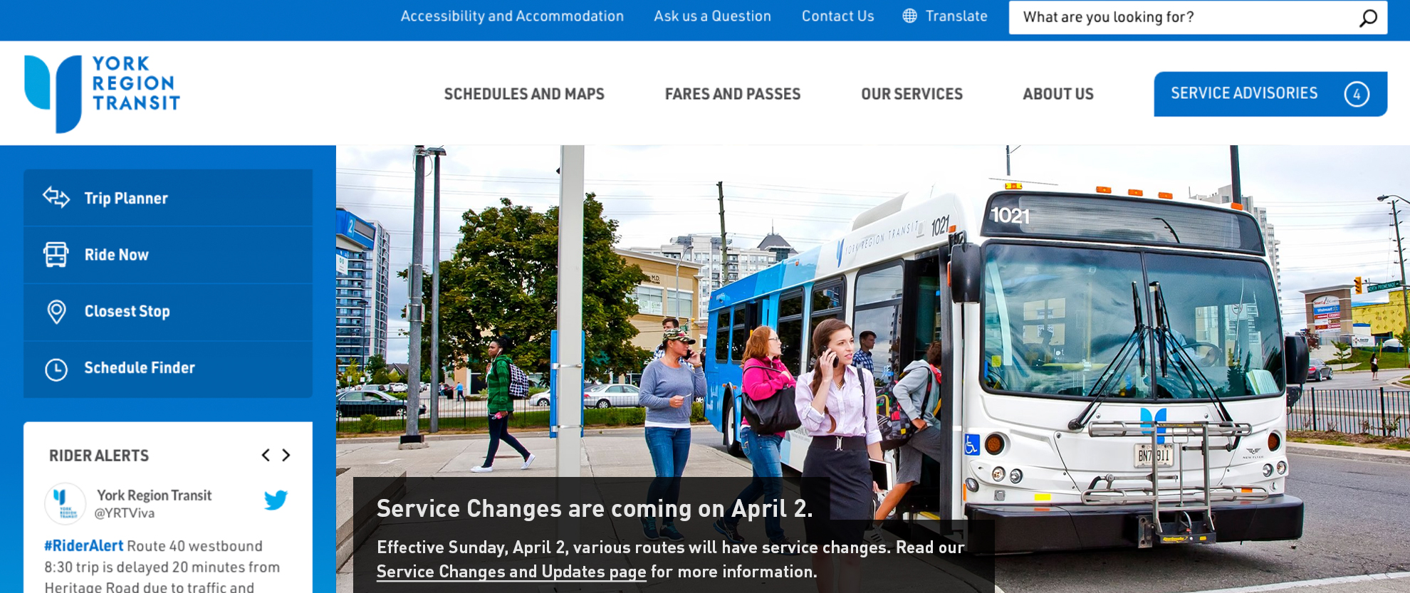
Over time, the site had collected new page content and features (trip planning tools and various custom apps) that required a holistic audit to uphold usability and experience. Some of the most-visited information sat deep in secondary pages, trip tools were scattered across separate apps, and Paratransit content was mixed in with conventional services.
Key Decisions
1. Write project requirements around riders
For the 2022 refresh, authoring the RFP scope allowed me to set user-centred requirements before any vendor was chosen. It also gave me a voice on the evaluation committee so we could favour proposals that understood both transit operations and frequent commuters using the YRT system.
2. Rename and surface Service Advisories
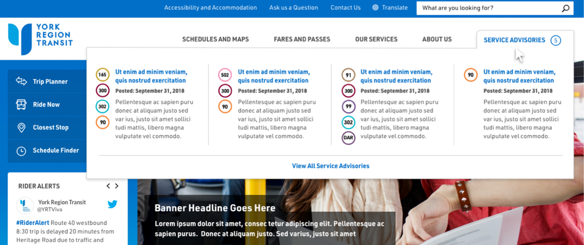
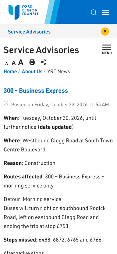
Planned service changes were among the most-visited content, but they were buried in the site, and their original “Rider Alert” name clashed with the #RiderAlert hashtag used for unplanned delays on YRT social media. In the 2019 refresh, I proposed renaming them “Service Advisories” and putting a notification-style button on the homepage for a quick-glance preview of active advisories for riders checking in on-the-go.
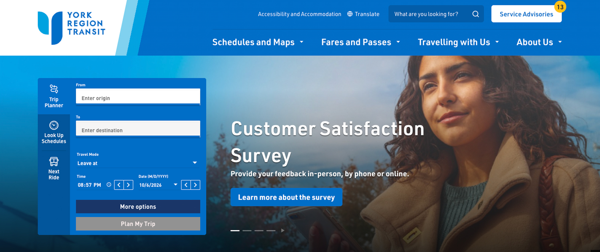
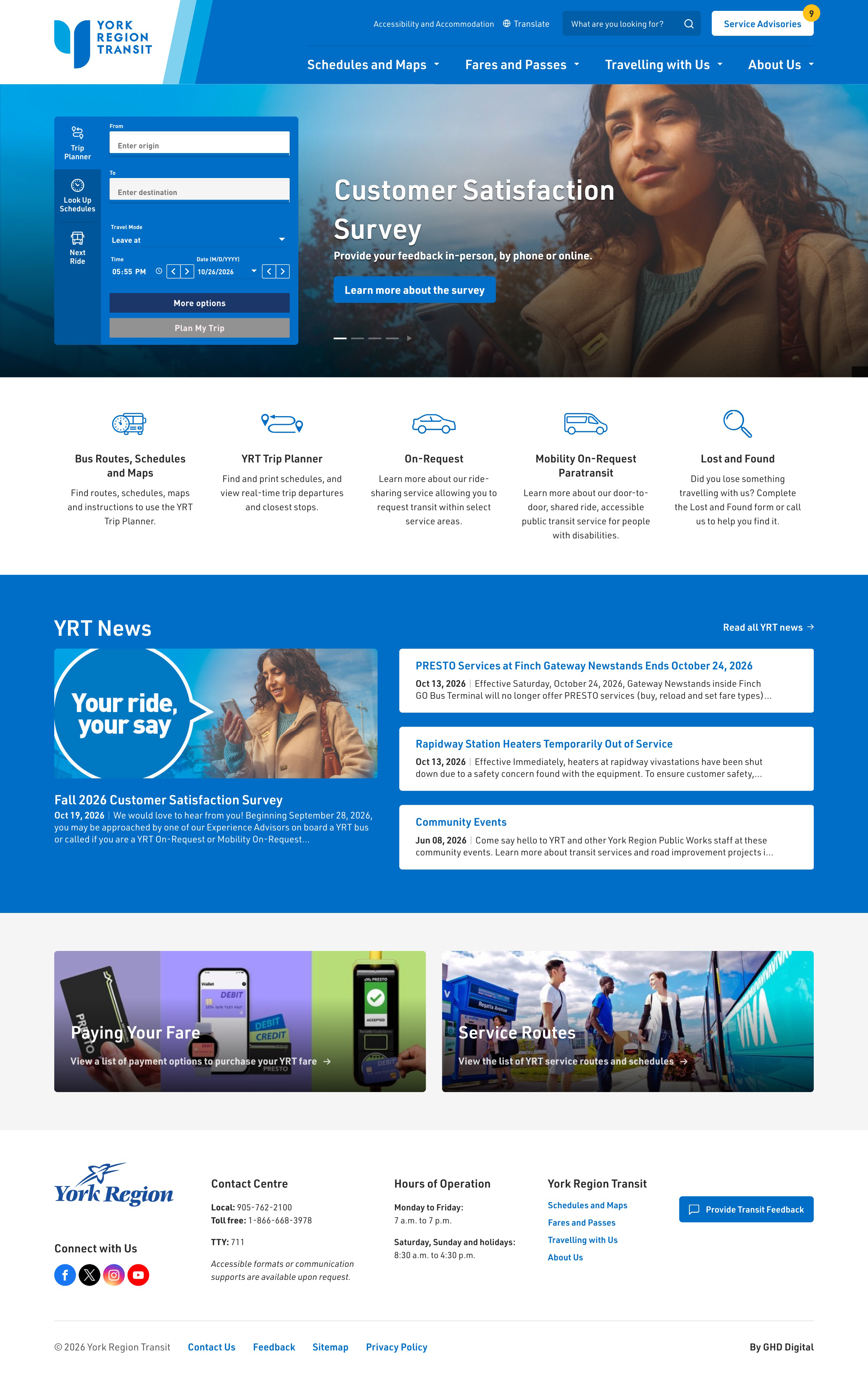
In 2022, I reworked the preview so it no longer depended on hover, which touchscreens can’t do. On desktop, one click now opens a side panel listing every active advisory, so riders open only the ones that affect their routes. On phones, a Service Advisories bar with the live count sits right under the header, and one tap goes straight to the full list.
3. Consolidate all trip planning tools in one place
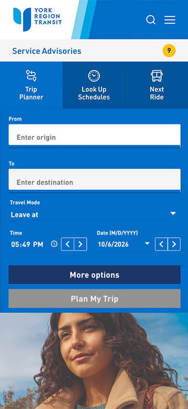
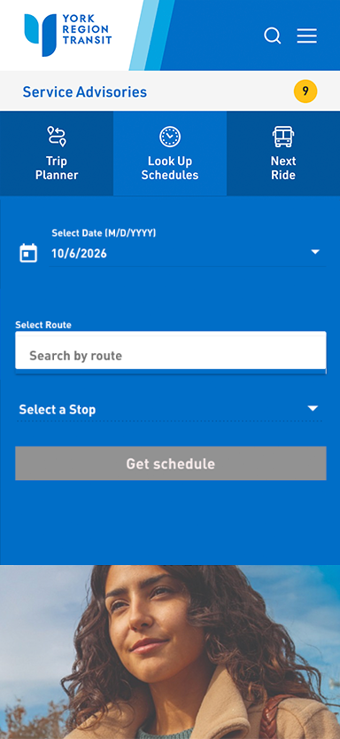
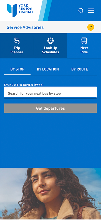
Trip planner, schedules and next-bus arrivals lived on separate pages as separate apps. Working with Transit Technology, I helped refine a single tabbed widget adhering to YRT branding on the homepage that brings them together so riders can plan from one touchpoint.
4. Give Paratransit riders their own front door
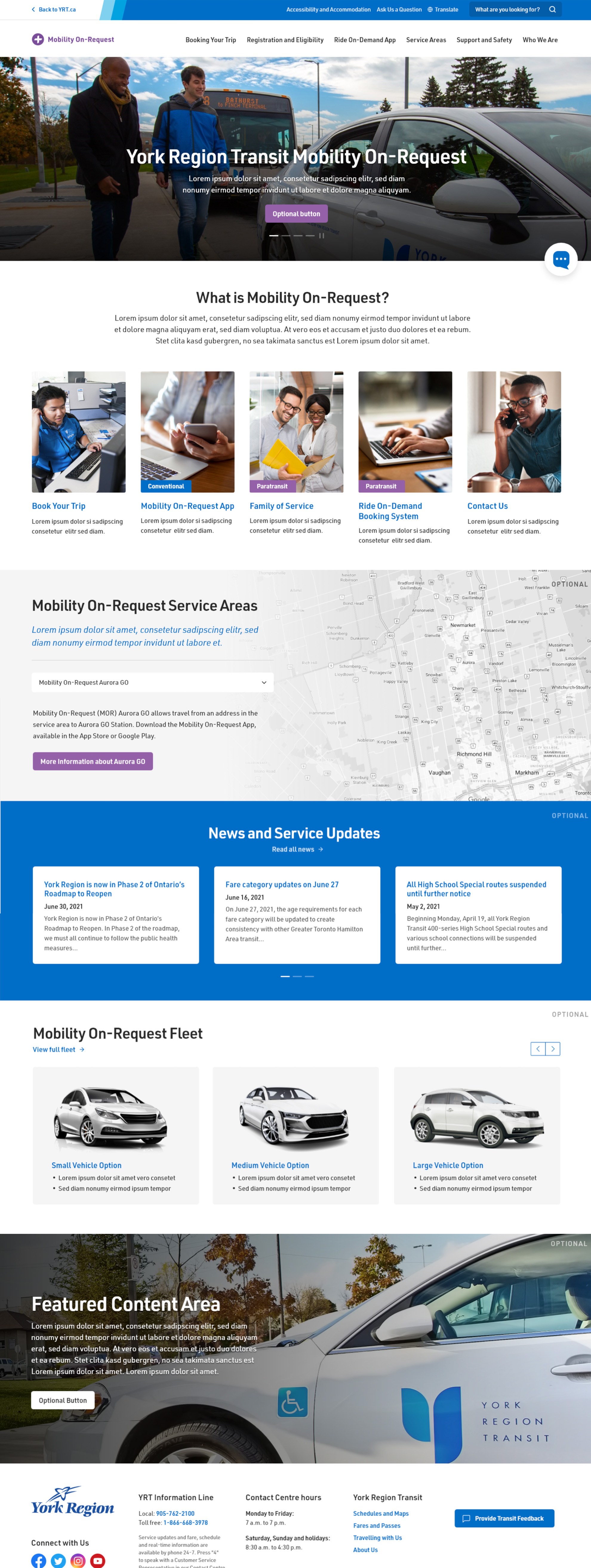
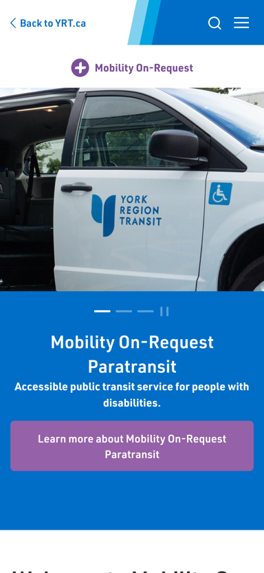
Mobility On-Request (MOR) accessibility clients struggled to find their information among YRT’s regular conventional services, and branding constraints meant the two couldn’t simply be separated. I proposed a dedicated landing page and led its information architecture: its own menu, news and service-area lookup.
Leading the Transformation
The consultant handled focus groups, wireframes and the build. My job was to collaborate with teams within the Transit branch for their feedback and involvement while keeping the result rider-centred:
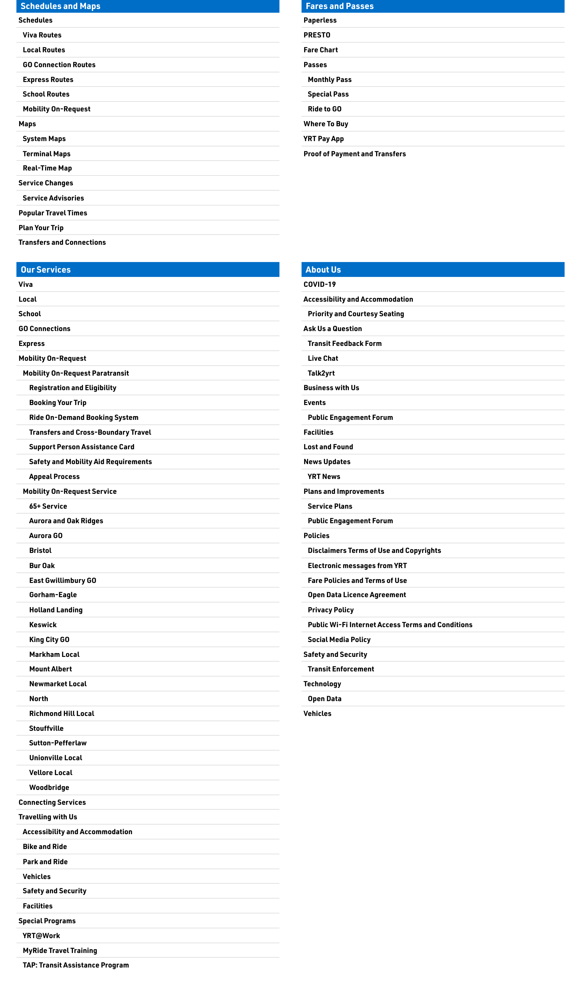
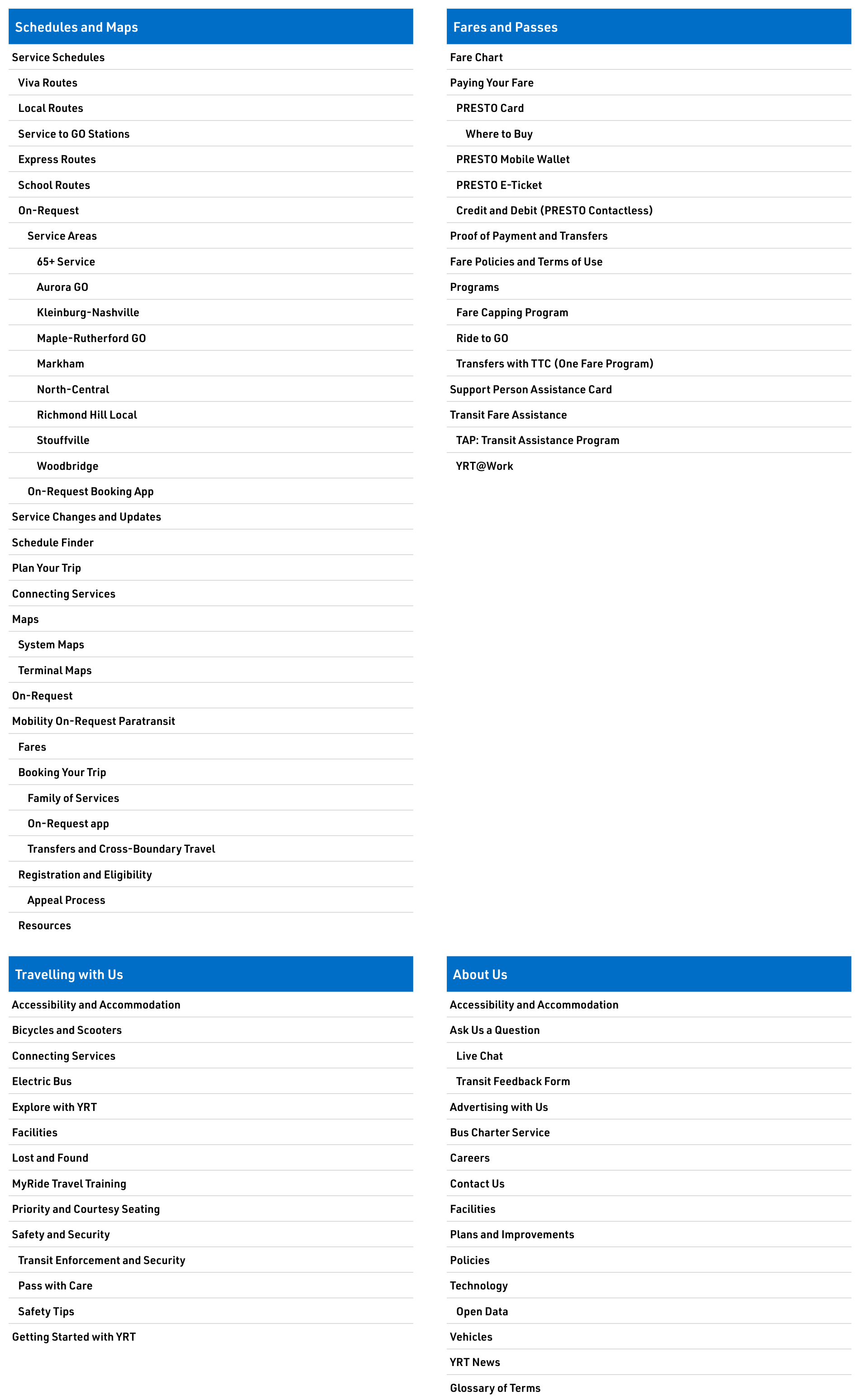
- Information architecture: refined the consultant’s sitemap so it followed riders’ needs rather than internal departments.
- Accessibility: beyond WCAG 2.0 AA, tested the site with a screen reader user from the YR Accessibility Advisory Committee and built in her feedback.
- Testing (UAT): co-ran user acceptance testing with internal staff, frontline staff and frequent riders.
- Updates to leadership: presented project updates to leadership on progress and new features, and secured buy-in for proposed features in a phased approach.
- Official launch: presented the new site to 200+ transit staff, many of whom use it on their phones to answer riders on the spot.
Outcome
- Improved user experience for staff and ridersTrip planning and service advisories are the site’s most-viewed information, which is why they were the focus. Both were already on the homepage, but are now much clearer and easier to use there. Call Centre staff also use them to answer inquiries, since they show the same public information riders see.
- A dedicated homepage for Paratransit clientsMOR clients can access relevant information and updates without regular transit service mixed in.
- Secured the most qualified consultant through an RFPThe winning proponent, with the most transit experience, is contracted for the next five years.
Reflection
Having led this refresh initiative twice now, I’ve learned the hardest part isn’t the design, but rather making sure everyone feels heard: frontline staff who talk to riders every day want different things from the website than office teams like Communications and Marketing. The most eye-opening part was working with a visually impaired member of the Accessibility Advisory Committee who relies on a screen reader. She showed me that accessibility isn’t only about the technology: it’s also about how content is worded and structured so people can get to what they need.