Back to the route Next stop: Lost and Found: A Narrative Game
Transit COVID Campaign
An award-winning, system-wide crisis campaign on mandatory health and safety measures in response to the pandemic. Designed in a 2-day turnaround and on the street in under a week.
- Role
- Lead Creative Designer
- Organization
- York Region Transit
- Timeline
- 2020 · 2 days to design
- Worked with
TL;DR
When the pandemic hit, YRT had to inform riders about the latest mandatory safety measures on every bus and at every stop, and quickly, all while trying to keep up with the ever-changing rules. I led the creative, chose a direct street-sign design approach, and built it as a plug-and-play system that even non-designers could quickly update.
- 2 daysDesign turnaroundFrom ideation to final design
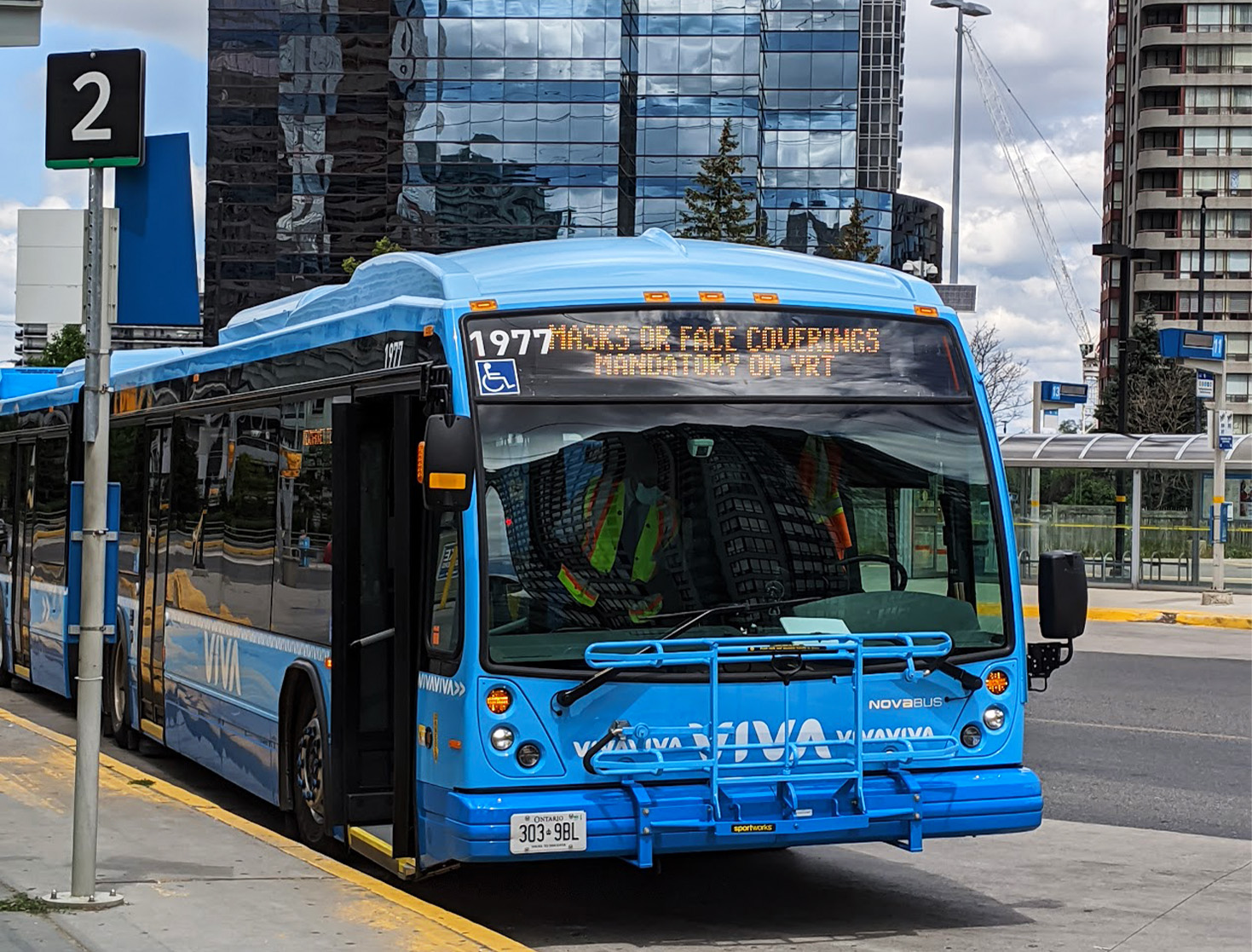
- < 1 weekTo go liveInstalled across the whole transit system
- GoldMarCom Award2021, Strategic Communications (Digital Marketing), won as a team
- 750,000ImpressionsFrom digital ads
- ~500,000Rotation playsOn digital bus stop screens
- 67,000+People reachedOn social media
The Problem
COVID happened. The safety message had to reach every rider, and many riders in York Region don’t speak English as a first language. On top of that, guidelines changed often and without warning. Each revision was an “all hands on deck” effort, so the layouts and print production had to be easy for anyone to create.
Key Decisions
1. Clarity and simplicity over charm
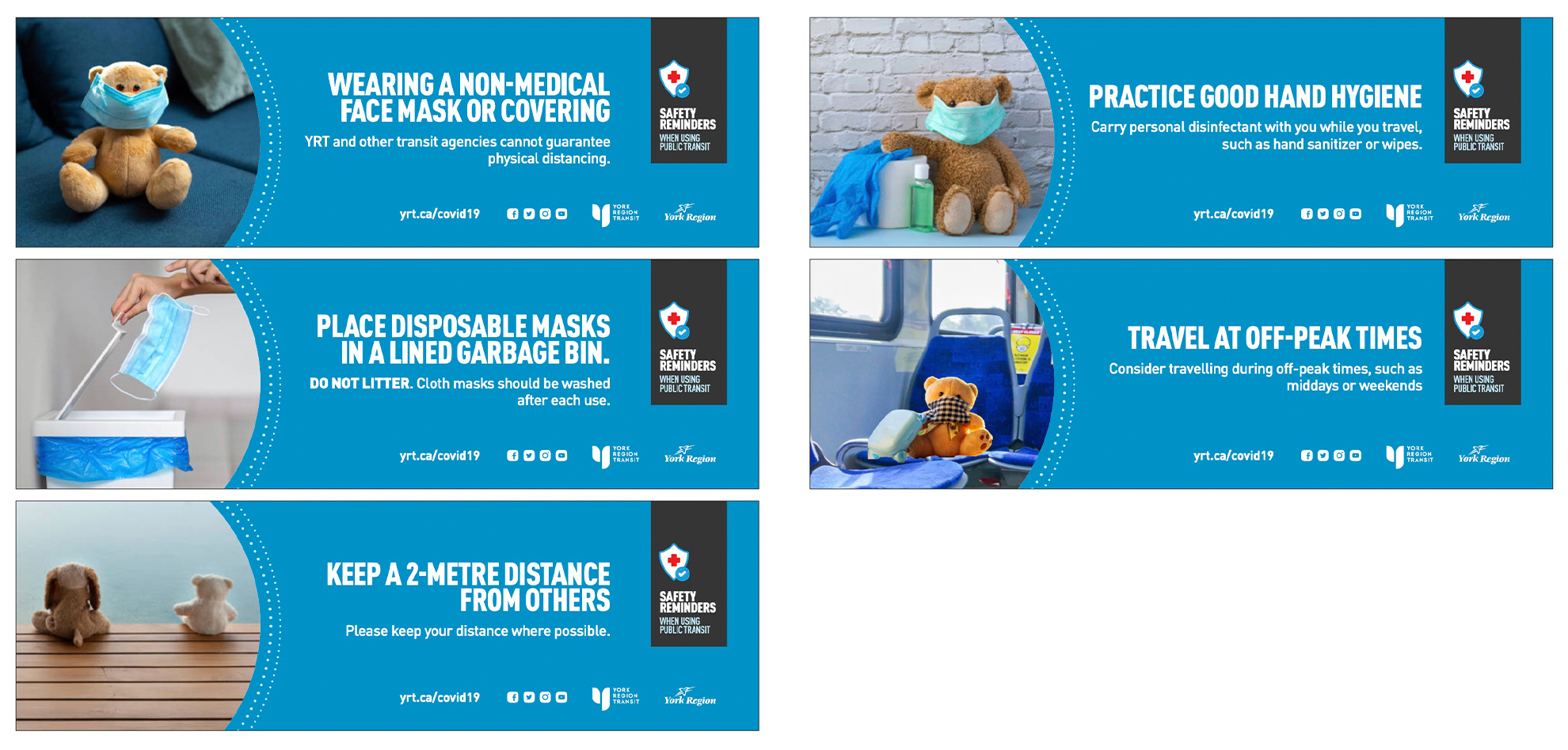
We explored a teddy bear concept, but it was deemed too cutesy and we wanted a serious tone. I went with a direct, icon-led approach inspired by the intent of street signs: eye-catching, to the point and universally understood.
2. Communicate with limited words
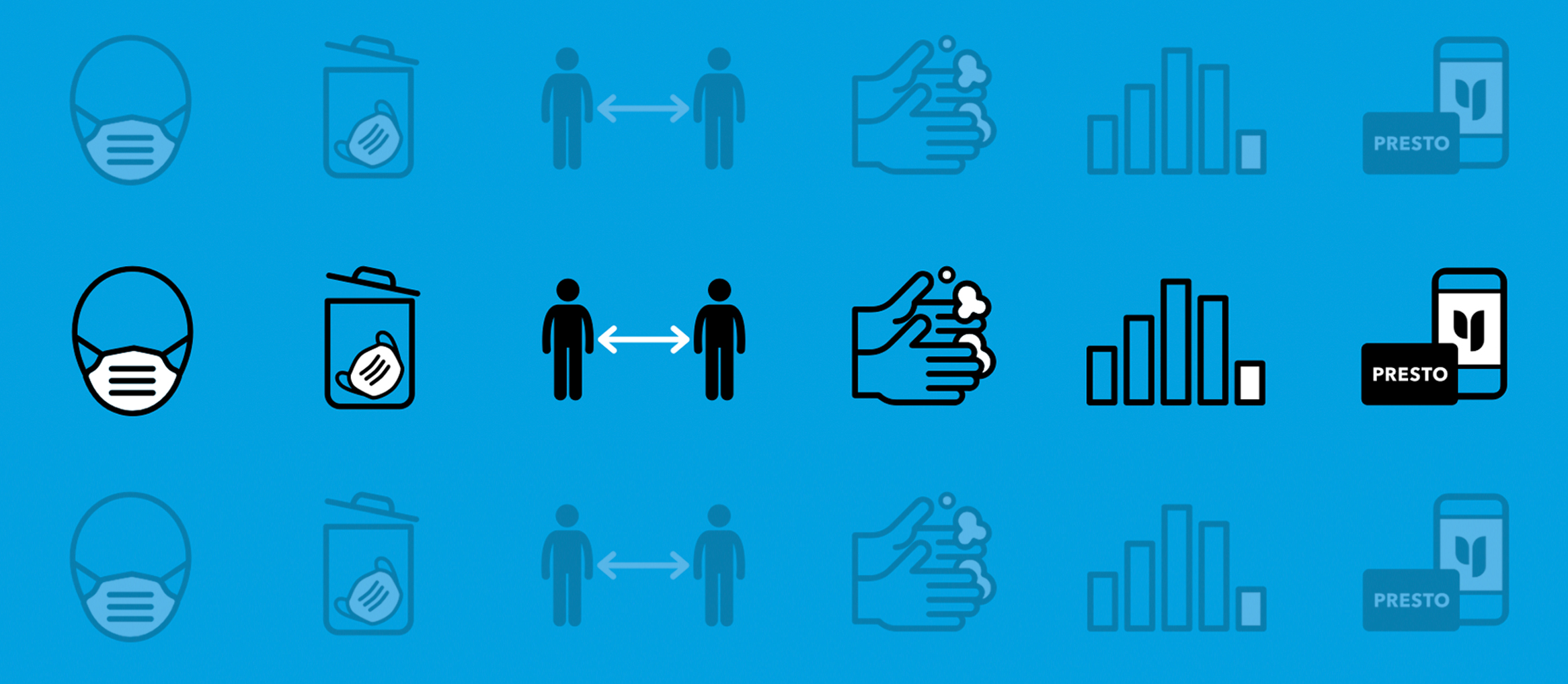
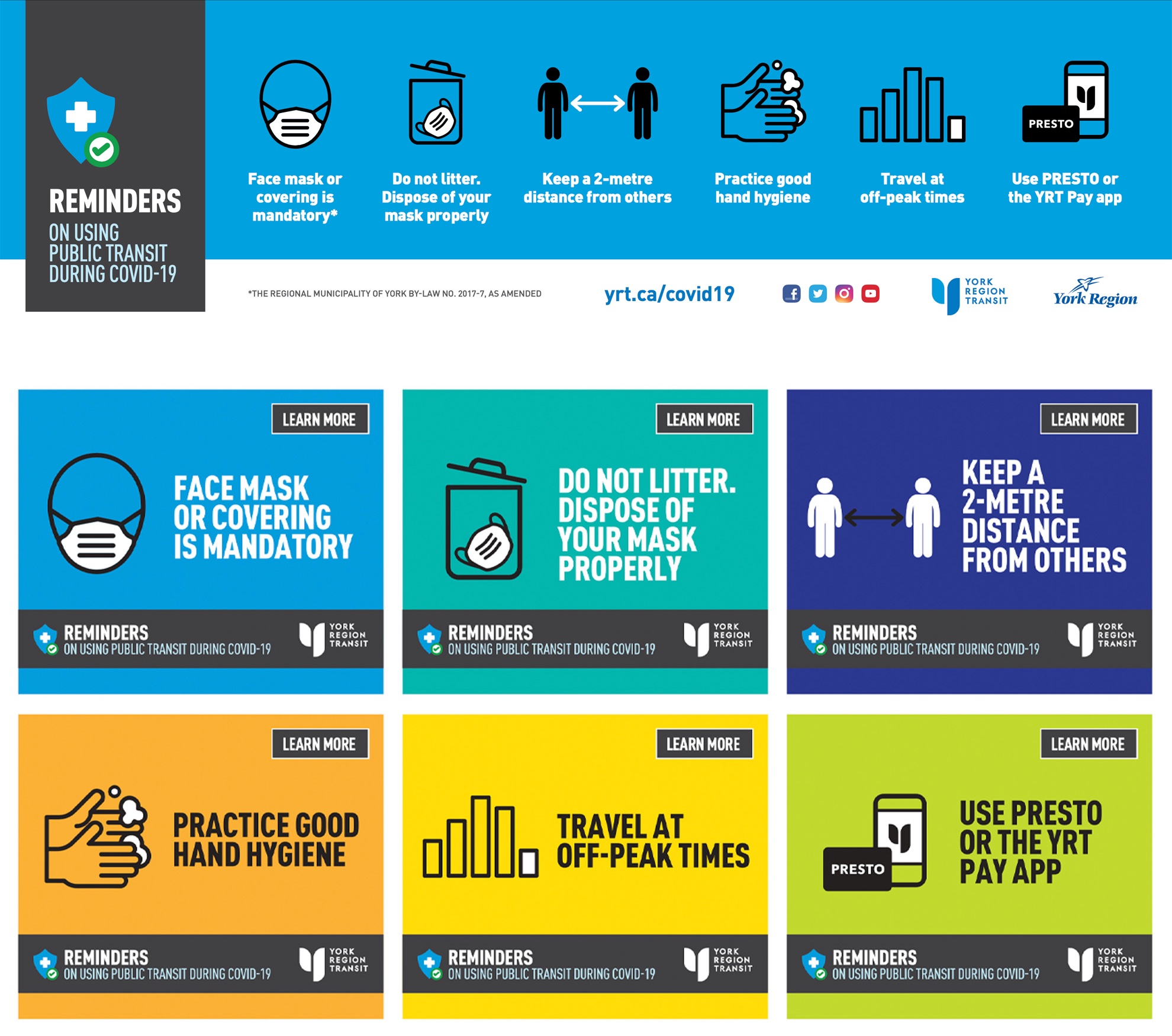
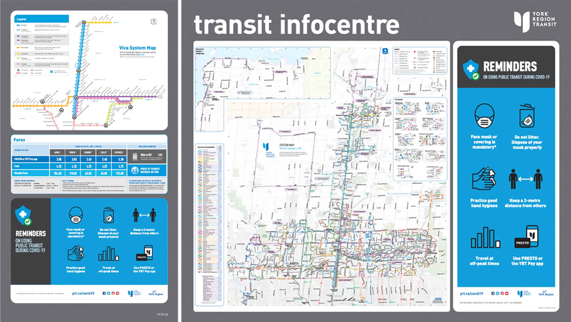
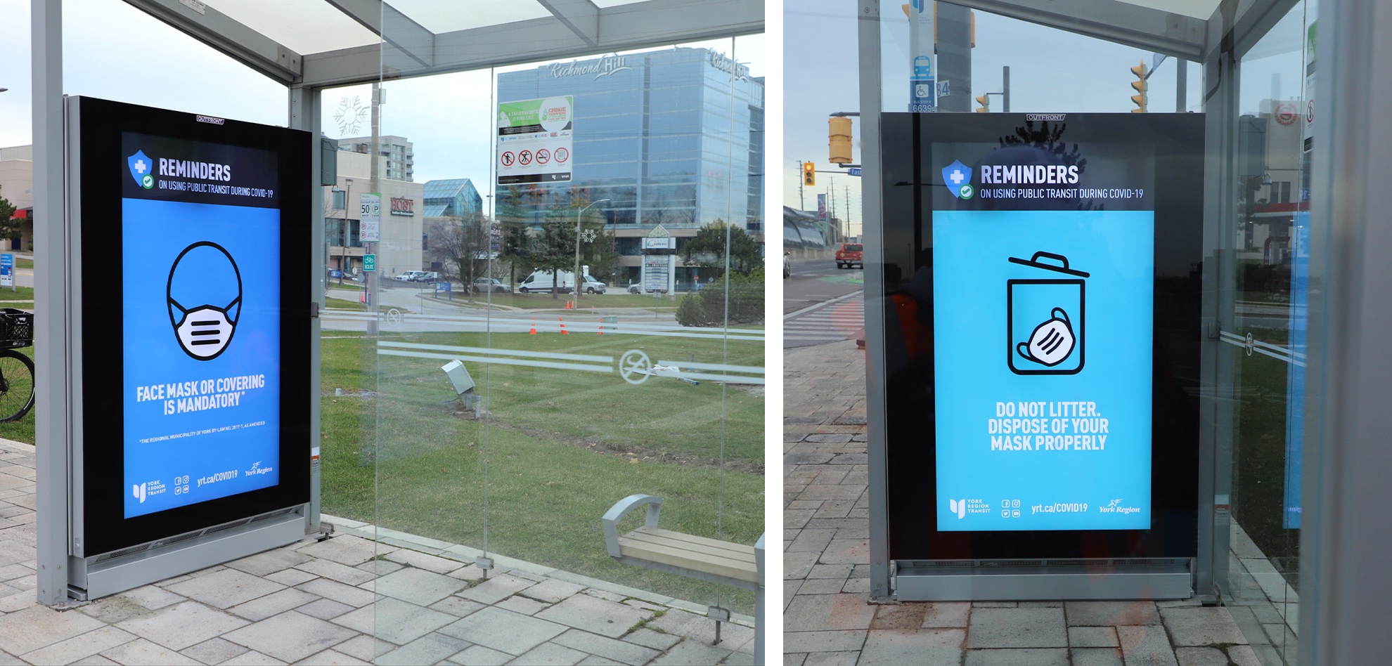
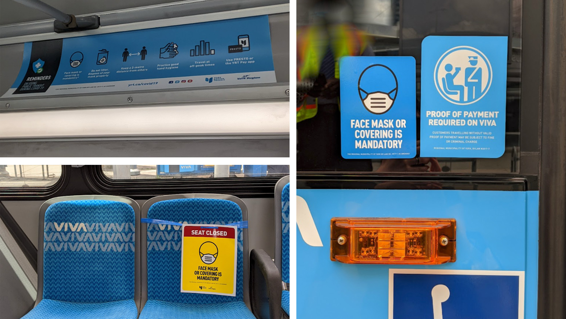
Each rule got one bold, black icon and a short title. For on-street print materials, the whole set sat on a single YRT blue so it read as one message, and the high-contrast icons carried the meaning on their own. Riders could understand it at a glance regardless of language, whether they saw it on a bus card, a shelter screen or a transit infocentre. On digital and social, each rule got its own colour so the rotation stood out.
3. Build an easily replicable system
Because the rules kept changing, I designed the campaign as plug-and-play templates. This way, co-op students and on-street staff could produce signage themselves without going through our team every time, so we kept up with deadlines without disrupting operations. Divide and conquer.
Outcome
- Kept pace with every mandate changeEach new rule meant reprinting and reposting signage on every bus, stop and facility across a vast region. The templates let us turn each round around fast enough to stay in step with public health mandate changes.
- Digital campaign ran across York RegionFrom October to November 2020, across digital ads, bus stop screens and social media.
- Gold winner of the MarCom Award, 2021Recognized in Strategic Communications (Digital Marketing) for how effectively it got the message out.
Reflection
Looking back, it’s a little ironic that this campaign won an award, when all we set out to do was make sure riders knew what to do. Mostly, I’m grateful to have been part of a crisis communication effort like this; it’s not every day you get to design something that reaches this many people. The real win was the teamwork: staff across the whole transit system pulled together to get the message across a region this size, fast enough to keep up with the mandate. It showed me what’s possible when everyone works toward the same goal.