Back to the route Next stop: YRT Website Redesigns
YRT Self-Serve Portal
A knowledge base and ticketing system designed to let riders resolve routine questions themselves, so the Call Centre can focus on emergencies.
- Role
- Organization
- York Region Transit
- Timeline
- 2023 to 2024
- Worked with
TL;DR
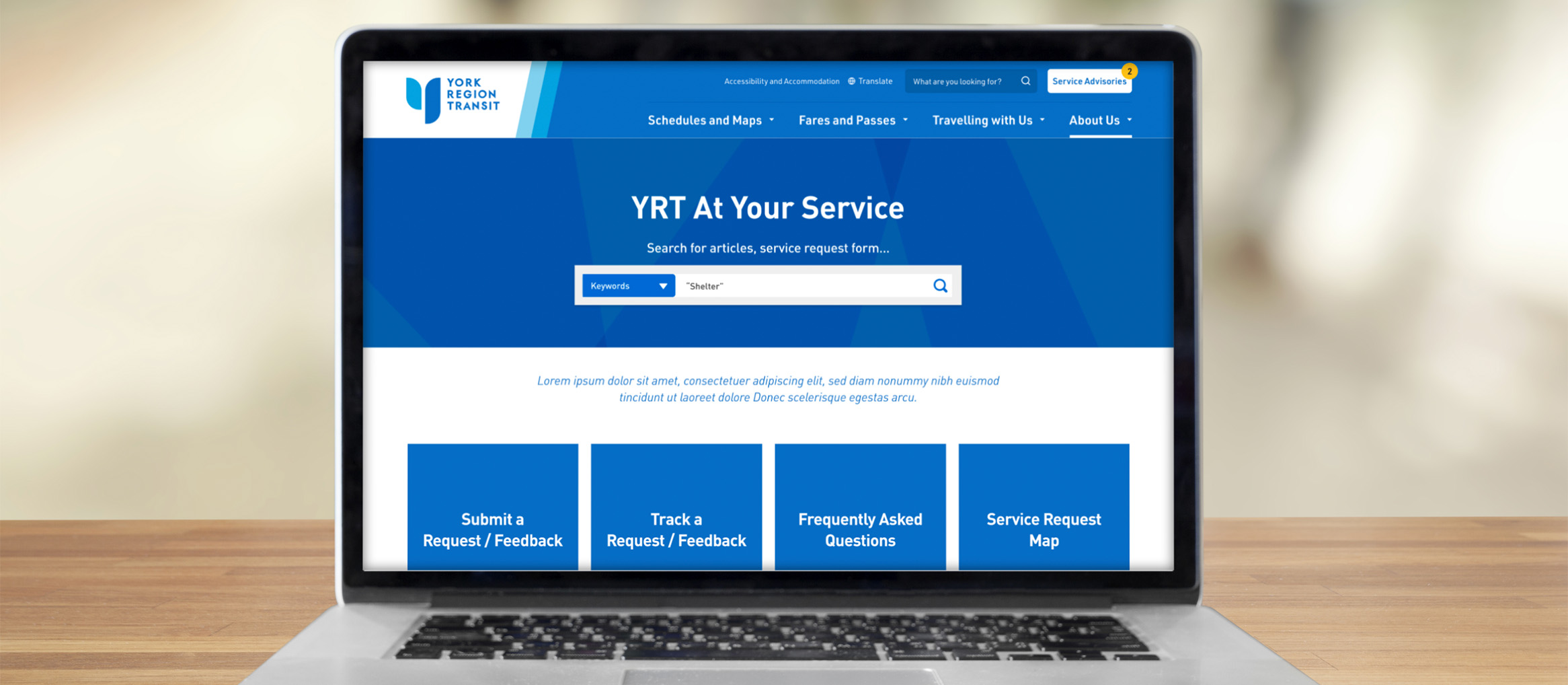
YRT’s Call Centre was overwhelmed by routine “where’s my bus?” calls. I led the design of its Self-Serve Portal to help alleviate call volumes. When a departmental merger led leadership to move the portal onto the broader York.ca site, I found a way to keep a dedicated transit experience within the Region’s budget and built a case by creating an interactive prototype to get buy-in.
- 151 → 12Public categoriesInternal Salesforce categories translated into plain-language, public-facing ones
- Lowered costson consultant feesUpfront work on data mapping helped allocate extra budget to the actual build
The Problem
The Call Centre handled everything from simple schedule questions to 911-level emergencies on the same lines. The portal had to serve as an automated triaging filter for riders to route their inquiries correctly, on top of a legacy Salesforce setup built around how staff log calls, which nobody wanted to touch.
Then came a second constraint where due to a departmental merger, the portal would also handle Transportation inquiries like potholes and construction to save money. Leadership assumed one backend only meant one website, so it would live on York.ca, burying Transit help on the regional government site.
Key Decisions
1. Translate the system’s jargon into plain language
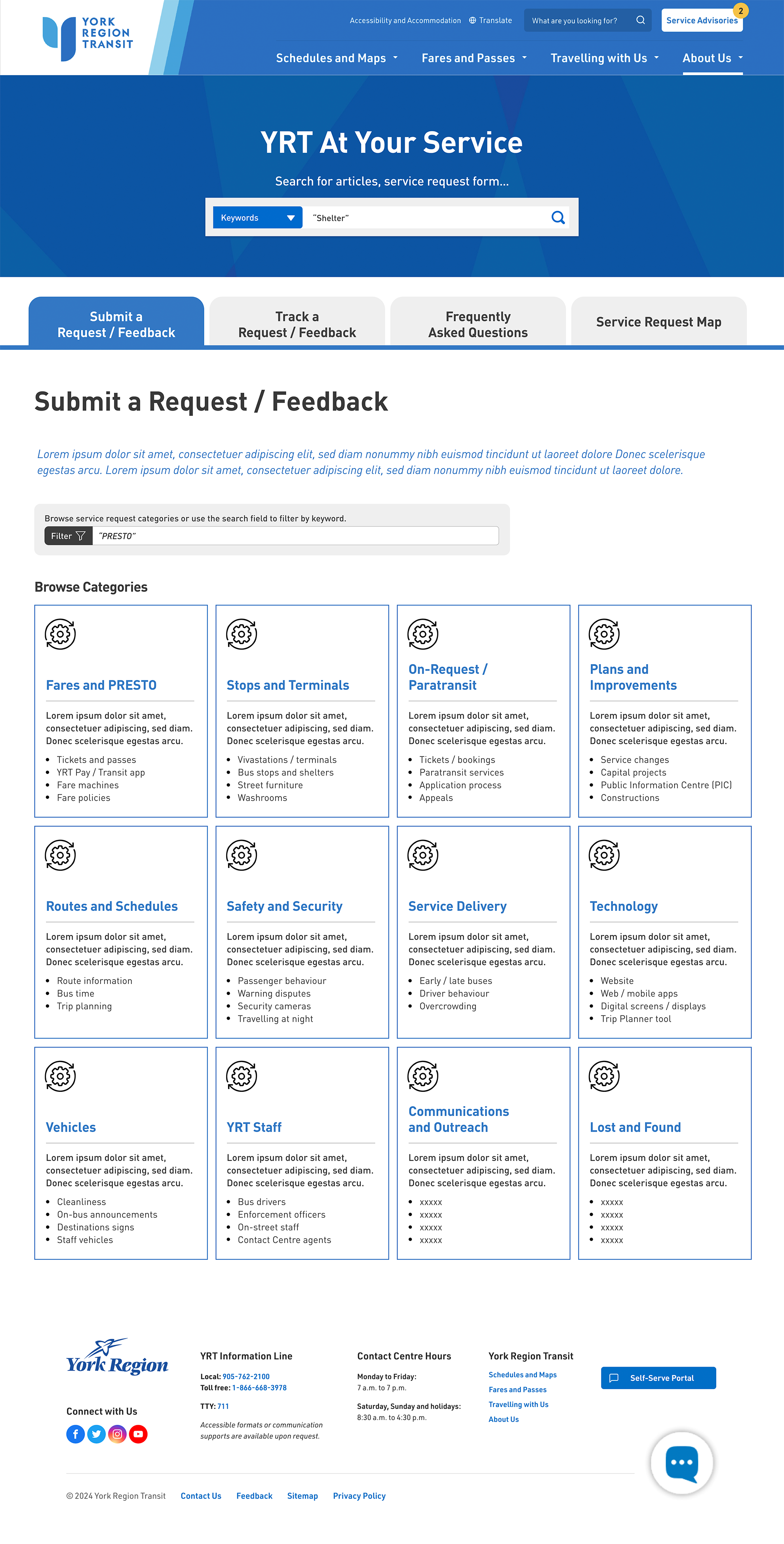
Working with the Call Centre and Transit Technology teams, I mapped how staff actually logged inquiries, then condensed its 151 internal Salesforce categories down to 12 plain-language ones. If riders picked the wrong category, staff would have to manually re-sort every ticket (effectively defeating the purpose).
2. Solve the constraint instead of fighting it
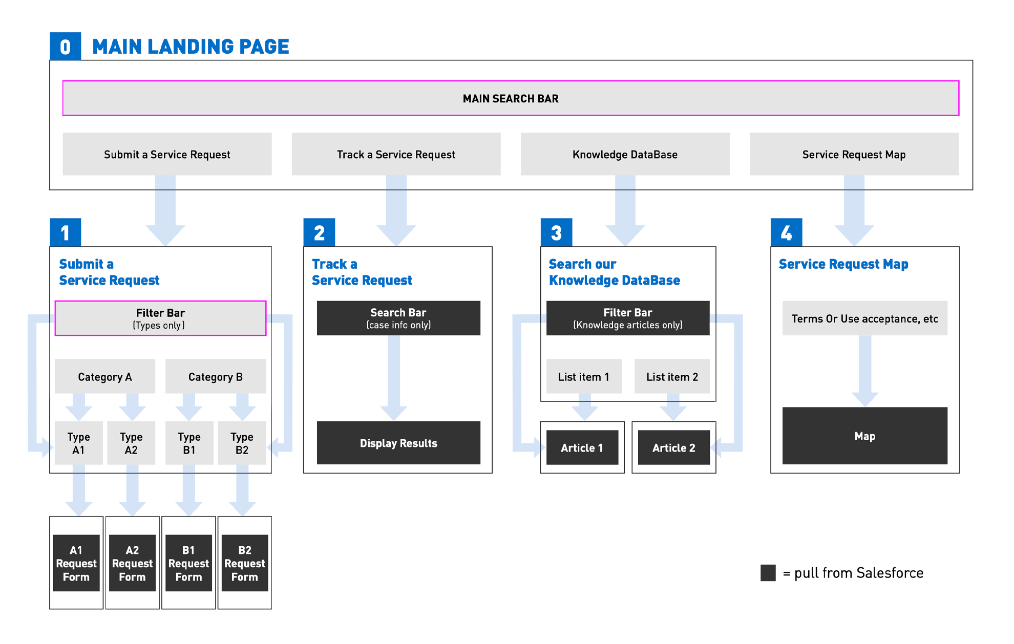
Pushing back on a budget decision wouldn’t work. During the data deep-dive working with our consultants, I learned that one Salesforce backend could feed two separate frontends: York.ca could get its regional portal (however they want to design it), and YRT could keep their dedicated one on YRT.ca, all on the same shared backend.
3. Use the “Show, Don’t Tell” approach
Rather than explain API routing to non-technical stakeholders and raise more questions, I proactively built a high-fidelity interactive prototype skinned with the existing YRT site branding (like it’s the real thing) to walk them through real-life scenarios: submitting a request, tracking it, and searching the knowledge base. Seeing the experience kept the conversation focused on the user journey. An annotated version then became the blueprint for our consultants.
Outcome
- Interactive demo won over leadershipThe “Show, Don’t Tell” demo paid off, allowing the Transit portal to be hosted on YRT.ca, keeping a dedicated, rider-first experience.
- Clear blueprint for consultantsThe upfront data mapping work helped define scope and implementation approach for Salesforce integration.
- Discovery fees came downBecause the UX and data mapping were done in-house, it freed up extra budget to be allocated for the build.
- The categories went live firstBy the end of 2024, the full portal was on hold due to contract delays. YRT had already used my plain-language categories to refresh its Transit Feedback Form, a first phase toward the full portal (still live as of October 2026).
Reflection
Looking back, this project taught me that a frontend is only as flexible as the system behind it. A polished design means little if it ignores how a backend nobody can change is organized, and understanding that is what led to the two-frontend solution. I also learned that leadership decisions aren’t always final if you can respectfully show why they don’t serve the public. Most of the work was communication: partnering with consultants as equals, hearing riders’ pain points through frontline staff, learning the backend’s limits from the technical team, and bringing it all to leadership as a case they could stand behind.